A custom fairing design often begins with a mood: stealthy, electric, race-inspired, playful. The difficult part comes later, when that mood has to become instructions for the nose, both sides, the tail and any bodywork that will remain on the motorcycle. A color name alone does not establish where a stripe begins, how it crosses a panel seam, whether the left and right sides match, or what happens when the original tank stays in place.
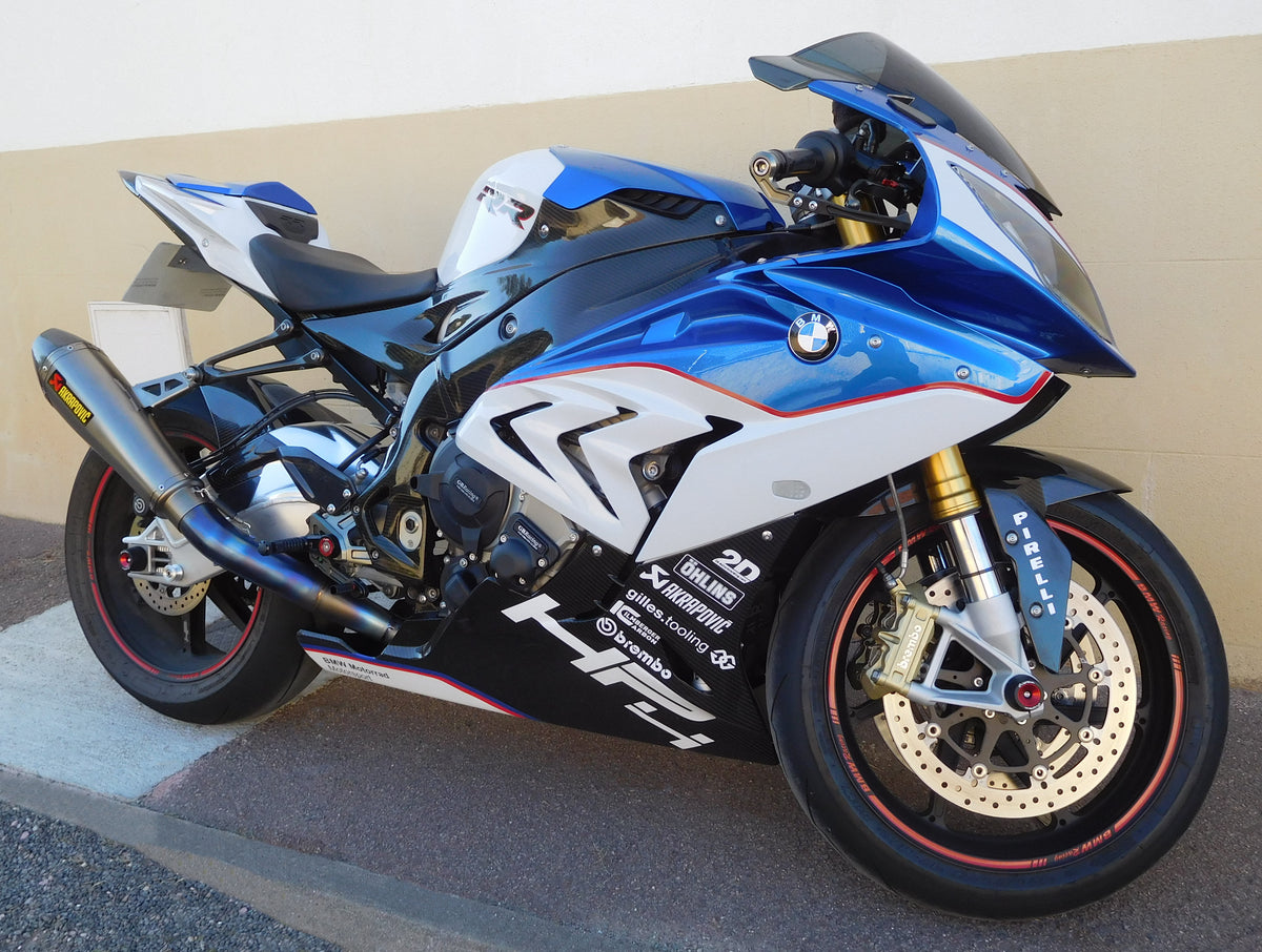
Cover photograph: a real BMW S 1000 RR HP4, photographed by Cjp24, CC BY-SA 4.0, used unmodified. It is contextual photography, not one of the four NiceFairings designs below or fitment evidence for an order.
NiceFairings' homepage video stories currently present four visibly different directions for the BMW S1000RR 2017–2018: gunmetal with gold and a forged-carbon look; silver/graphite with electric green (AB013); metallic orange with pearl white and gloss black (AB036); and pink with gloss black and smoke grey (AC023). The site descriptions identify finished-bike and/or set views for these examples. This article treats them as displayed design references, not as documented customer projects, road tests, exact paint formulas or proof that a particular part is included with every order. No customer before/after history has been supplied for this piece.
The useful comparison is not “Which one is best?” It is “Which set of visual decisions am I prepared to make—and verify?” The same model generation provides a common canvas. The four palettes create different risks at seams, retained components and finishes. Looking at them together can produce a much clearer custom fairing request than copying a favorite screenshot without explanation.
Direction 1: Gunmetal and gold — make contrast deliberate
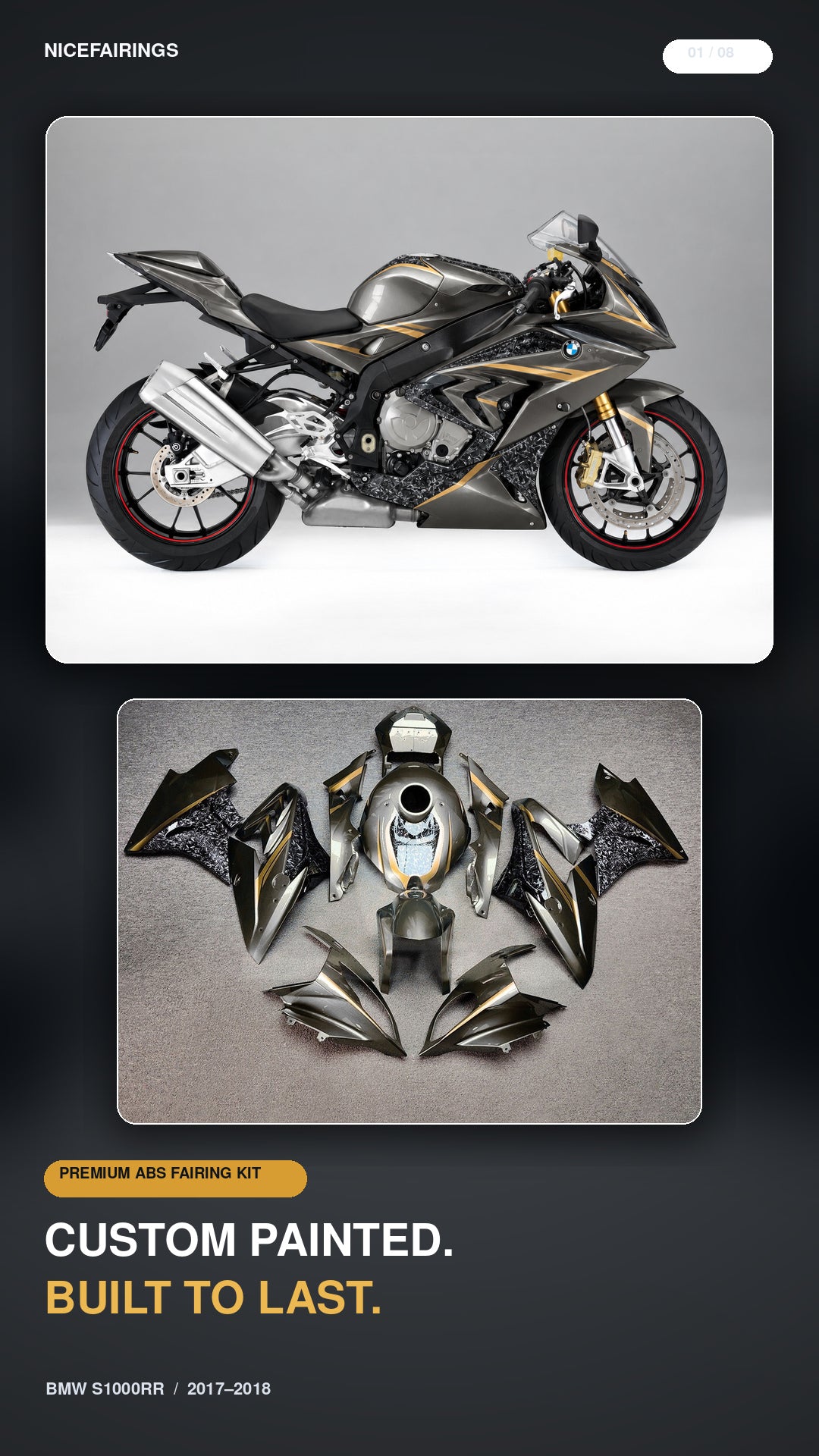
Dark neutral plus a warm metallic accent can create a restrained bike with a clear focal point. In the NiceFairings story, the dark field is described as gunmetal, the highlight as gold, and some surfaces as forged-carbon-look. Before approving a similar idea, ask which of those are actual paint colors, which are graphic effects, and which parts receive each treatment. “Forged-carbon-look” describes appearance; it should not be interpreted as a claim that the panels are made of forged carbon.
This direction succeeds or fails at its boundaries. A small gold detail on the nose can feel coherent if the eye meets a related detail on the side or tail. Too many disconnected gold marks can make a set feel like individually decorated pieces rather than one motorcycle. The brief should identify the priority view: side profile, front quarter or rear quarter. Then mark the intended accent path across panels. If a line crosses a removable side piece, ask for a proof that shows the joined edge, not separate glamorous close-ups. If the retained tank is black, blue or a different shade of grey, include it in the mock layout; the motorcycle cannot be visually judged as only the replacement panels.
Finish deserves a separate line in the approval. Gunmetal may look very different in matte, satin or gloss. A carbon-look area beside painted gunmetal needs a specified relationship rather than a vague “dark.” In a photograph, reflections may make two different finishes appear similar—or make one finish appear to be two colors. Ask for consistent-light views and clearly name the intended finish for each panel.
Direction 2: Silver and electric green — control the loudest color
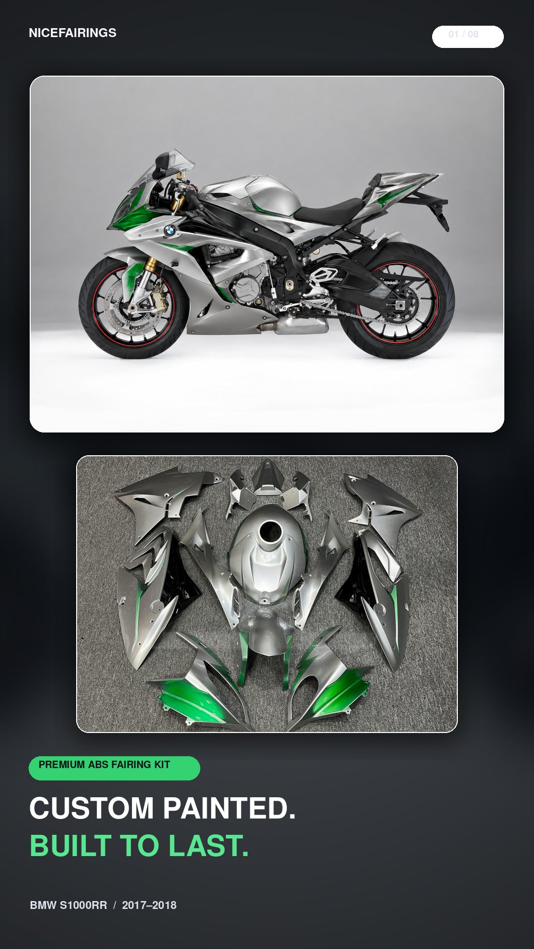
The AB013 description pairs silver and graphite with electric green. The green is the immediate attention signal; silver and graphite give it a structure. If you choose a high-energy accent, decide whether it should create one continuous route through the bike or appear in separate points. For example, a green element on a front-quarter image may look balanced while a large green area on the tail changes the entire side profile. Do not approve the palette from a single close-up.
Bright accents also expose alignment decisions. A narrow stripe that crosses two panels can appear broken if its height changes at the joint. A graphic that follows a side fairing's curve may need a different shape on the other side to read as intentional in perspective. These are design questions, not assumptions about manufacturing tolerance. The review should include left and right assembled views, plus an individual panel layout if the artwork is complex. Ask the supplier to flag any edge where the proposed graphic cannot be continued as drawn.
There is a practical reason to preserve the design number in the conversation. “Silver and green S1000RR” could refer to many schemes. “The AB013 direction shown on the NiceFairings homepage, with these marked changes” is a much tighter reference. If you want a different green, specify it separately. A screen rendering can orient the design but cannot guarantee a paint match to a helmet, wheel stripe or retained tank without an agreed reference and appropriate review.
Direction 3: Orange, pearl white and gloss black — plan the large areas first
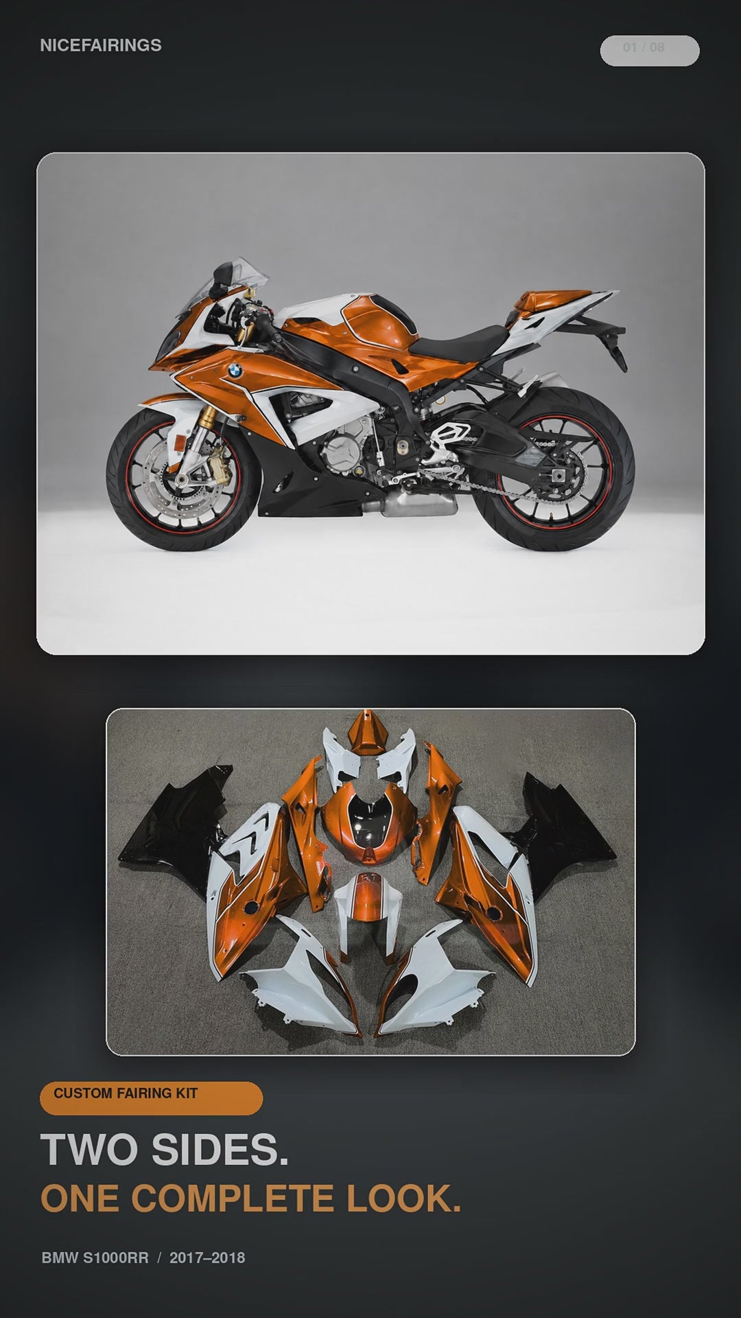
The AB036 story describes metallic orange, pearl white and gloss black. Three strong surface identities make this a different problem from adding a small accent to a neutral base. Before discussing logos or pinstripes, allocate the broad masses: what dominates the nose, what dominates the side, what leads into the tail, and how the retained tank participates. If every panel has all three colors in equal measure, the motorcycle may lose a visual hierarchy. A simple area map—large, medium, small—can be more useful than another inspirational image.
Pearl white and metallic orange may shift noticeably with lighting, so the reference should show the assembled design in more than one view. Gloss black can create a visually sharp boundary, but a black band across the lower side might also conceal a gap or shape that matters for the buyer's expectations. Ask to see the outline of the actual panel in the proof, not only the artwork floating over a generic bike image. If a customer wants the fender or tank cover in one of the three finishes, name that part explicitly; do not assume it is included in a kit because it appears in a story view.
This palette is a good example of why “make it exactly like the video” is incomplete. Does “exactly” include decal placement? Are wheel colors part of the visual reference but outside the fairing order? Does the customer expect both sides to be mirror images? A short annotation sheet can answer those questions before a painter is asked to guess. The S1000RR 2017–2018 collection is useful for comparing related designs, but each listing still needs its own application and contents review.
Direction 4: Pink, gloss black and smoke grey — protect the intended personality
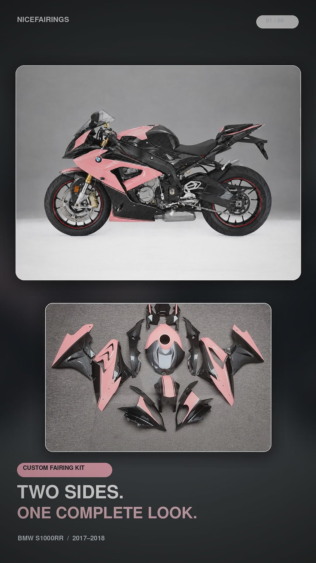
AC023 is described as pink with gloss black and smoke grey. It demonstrates that a sportbike palette can be bold without borrowing a race team's exact livery. But “pink” ranges from muted to fluorescent; “smoke grey” can read warm or cool depending on nearby black and the lighting. A rider who likes the overall idea should decide what must be preserved: the pink's relative brightness, the dark balance, or the location of the grey. If all three are negotiable, the resulting design could look very different while still matching a list of three color words.
This direction may be especially sensitive to the real motorcycle around the kit. A black frame, wheel set and seat can anchor the palette; a retained tank in another color can compete with it. Photograph the bike as it is, including the components that will stay. A design proof should depict those retained parts honestly, preferably from both sides. Do not use a generated hero that invents a matching tank, a new wheel color or a perfectly clean garage, then treat that invented scene as the customer's promised outcome.
For names, numbers or logos, seek written permission where needed and keep the artwork separate from color approval. A favorite team motif can inspire a mood without copying protected marks or implying a sponsorship. If an emblem is essential, supply the exact file and agree its size and placement. Authentic bike branding that is already on the motorcycle should not be “corrected” by AI or hand-painted into a product photo without a real reference.
Compare the reference, then inspect the motorcycle you actually own
The four NiceFairings visuals pair a bike view with a laid-out panel view. That pairing is valuable, but the two images answer different questions. The bike view helps you judge the overall balance of light and dark areas. The panel layout helps you locate an accent on individual pieces. Neither view, on its own, confirms what will be supplied in your particular order. A tank cover, windscreen, inner trim, fastener or wheel seen in a presentation image should not become an assumed line item. Ask for the listing's current parts description and a written answer where the scope is unclear.
Make a quick comparison sheet with one row per direction. In the first column, name the one feature you would keep: a narrow gold line, the green's position, the orange-to-white ratio, or the pink's dominance. In the second, name what would conflict with your real bike: a retained tank color, nonstandard exhaust, changed seat or different wheel finish. In the third, write the evidence you still need. An assembled left and right view might settle color balance; a labeled flat-lay might settle piece identification; a close-up might settle a seam. These requests are more useful than asking for “more photos” without specifying a decision.
If the motorcycle is already modified, photograph it in ordinary daylight before requesting a design. Include both sides, the nose, tank, tail and any repaired or drilled panels. These photographs are not a promise that a replacement kit will fit every altered mounting point. They give the workshop a truthful canvas and surface possible conflicts early. Keep a dated copy of the reference design and your approved changes so an attractive promotional image does not quietly replace the actual brief.
One useful approval test is to cover the color names and ask a second person to describe the proposed bike from the mockup. Can they identify the dominant field, the accent route and the tail treatment? If not, the proof may be too cropped or the hierarchy too weak. Repeat the test with the left and right views side by side. A design that reads well from one flattering angle may leave an unexplained blank area on the other. This does not mean both sides must be identical. It means any asymmetry should be deliberate and visible before it is painted. Finally, ask whether the proof uses the same tank, seat and wheel colors that your motorcycle will retain. If not, label those differences directly on the approval image.
A design comparison becomes useful when it creates decisions
After viewing the four NiceFairings stories, write four sentences rather than sending four screenshots with “something like these.”
- Model and scope: “My motorcycle is a BMW S1000RR 2017–2018 [state exact year and variant], and I want to replace [named panels].”
- Base hierarchy: “Use [one story/design number] for the overall distribution; the dominant color should be [color] on [named surfaces].”
- Changes: “Keep [specific element]; change [specific element]; leave [named area] plain. These original parts stay on the bike: [list].”
- Approval evidence: “Please show both sides, front quarter and the full panel set; mark any graphic that crosses a seam. Confirm exact supplied pieces and finish choices in writing before production.”
The brief can be developed through the custom-design route. A 2017–2018 made-to-order listing is another place to inspect the currently advertised options and ask about scope; do not assume its photos are the four homepage designs. If you instead choose an existing design, link the exact listing and option number. In either case, do not confuse visual approval with fitment verification. The advertised model-year range and the actual motorcycle configuration still need to be checked, especially if a previous owner changed headlights, brackets, exhaust, seat or inner trim. A design video can help you choose a look; it cannot inspect those parts for you.
Finally, decide what evidence would satisfy you before shipment. A completed left-side photograph may answer a color-placement question; it may leave the right side, tail detail or included-parts count unresolved. Ask for the relevant views in advance, while recognizing that the shipping policy describes finished photos as available when possible. Keep the approved brief and any written piece list, then compare them with the actual shipment on arrival.
Four color directions are useful because they force choices. Gunmetal/gold asks for controlled contrast and honest material-language. Silver/green asks for disciplined accent placement. Orange/white/black asks for hierarchy among large color areas. Pink/black/grey asks you to protect a distinctive personality across the whole real motorcycle. None is a universal winner. The best design is the one whose important decisions can be stated clearly, checked on both sides, and understood by the rider and the workshop in the same way.
Image note: the four design-reference graphics above are NiceFairings presentation visuals. They are not documentation of a specific customer order or a guarantee of included pieces.


.jpg)