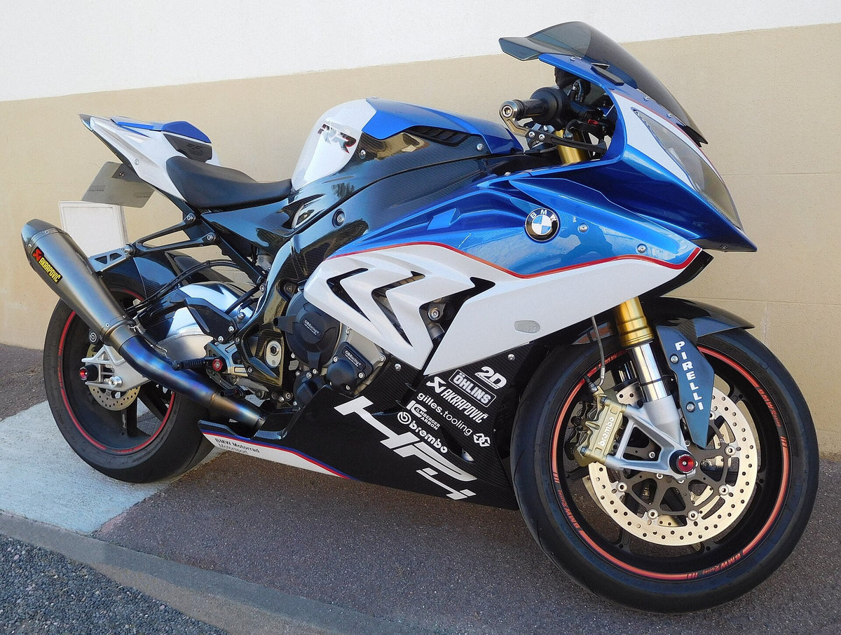
Cover photograph: Cjp24, Wikimedia Commons · CC BY-SA 4.0. Resized for display; image content unchanged. Real motorcycle reference; not a NiceFairings product or conversion example.
A strong BMW-inspired paint scheme starts with the fairing underneath it. The same stripe can frame one headlight neatly and crowd another; a broad blue field can look balanced on one side but disappear into the vents on the other. Instead of copying a finished motorcycle panel for panel, use its color relationships as a starting point. This guide explores three layout directions for the S1000RR and shows how to judge them against the actual nose, side panels and tail of your bike. These are editorial design suggestions, not a decal installation guide or a fitment claim.
Key Takeaways
Treat blue, red, and white as building blocks for your bike's shape.
Respect your bike's asymmetry: plan each side separately with real photos.
Work around vents and headlights: let stripes flow, not cut through.
Choose a color layout that fits your model year and personal style.
Use a thumbnail check to ensure your design reads clearly from all angles.
BMW S1000RR M-Inspired Graphics: Visual Language
The M Palette as a Starting Point
Separate the M emblem from the wider motorcycle color scheme. BMW describes the original M stripe colors as blue, violet and red in its history of the M logo. White bodywork is a useful background, not one of those original three logo stripes. The white, blue and red layouts discussed here are BMW-inspired compositions, not official paint specifications or a claim that the motorcycle has a factory M package. Painting an S1000RR in this style does not turn it into an M1000RR.
The real work here is color blocking. Just placing stripes will not carry the design. You need to decide where large fields of white, blue, or red will sit on the fairing. A broad white panel on the side might need a careful blue block and a thin red separator to feel balanced. A layout led by deep blue might use white empty space and small red accents to keep the nose from feeling too heavy. These are design choices, not factory options.
Respecting the S1000RR's Asymmetry
Your bike has its own identity. Study the actual left and right fairing surfaces, including their openings, panel boundaries and badges. Do not assume the available painted area mirrors perfectly from one side to the other. The design can remain recognizably related across the motorcycle while changing the size or route of a color block to suit each surface.
Take real photos of both sides of your specific bike. Never flip a photo to fake the other side. Never reverse lettering to make a mirrored graphic work. Look at how the visible vents break up the panel surface. A stripe that runs straight through a vent opening will look broken. A stripe that flows around the vent will look intentional. The goal is visual balance, not mechanical symmetry. Your M-inspired graphics should make the fairing's curves look better, not cover them up.

Nose Composition and Headlight Shapes
The nose gives the design its face. Headlight openings, the windscreen edge, air openings and the centerline compete for attention, so first mark their positions on a straight-on photograph of the actual bike. Then sketch color onto the painted surfaces. Avoid treating every black area in a photograph as an intake or assuming that every S1000RR generation has the same arrangement.
Asymmetric vs. Twin-Light Noses
BMW’s 2015 S1000RR announcement describes its asymmetric headlights. On a nose with visibly different light shapes, a perfectly mirrored stripe may not produce visual balance. Look at the amount of painted area remaining beside each opening, rather than judging the line from the centerline alone.
The new 2019 S1000RR announcement provides a different nose and lighting reference. When working with a later, more symmetric-looking front, compare a centered treatment with an offset one on photographs of that exact version. These design references establish neither interchangeability nor incompatibility between specific aftermarket parts; that needs separate fitment evidence.
For an asymmetric nose, compare two drafts: a slim center accent that leaves generous space around both lights, and an offset color block that responds to the larger painted area. Neither is automatically better. Check both straight-on and from three-quarter views; a line that seems balanced in a flat mock-up can become crowded when it wraps around the nose.
Preserving Intake Outlines
Use the visible openings on your own nose as boundaries in the sketch. A line crossing an opening can appear interrupted; that can be intentional, but its direction should remain easy to follow on the painted surfaces either side. A quieter alternative is to end the color block before the opening and let the dark shape provide contrast.
Keep air openings, light lenses and mounting areas outside the proposed painted graphic surface. For this exercise you are changing the composition, not the structure or function of the part. Show the designer which surfaces receive color and which remain untouched.
Where there is a narrow painted band beside a light or opening, test a thin red separator against leaving that band plain. Small areas quickly become busy when they carry stripes, lettering and a badge together. Give the primary shape room to read; a more restrained nose often works better with a detailed side panel.

Side Panel Graphics and Vent Work
The side panels give your color scheme its longest continuous view. Their openings and changes of plane matter more than matching every stripe end exactly. Treat the left and right photographs as two related drawings, with a shared palette and hierarchy but space for different routes around the actual bodywork.
Left and Right Panel Independence
Take real photographs of both sides of your specific bike, ideally from similar heights and distances. Do not flip a photograph to manufacture the opposite side: it reverses lettering and conceals the real components. Mark panel edges, vents, badges and the visible relationship to the tank, seat and lower fairing before drawing your stripes.
When you plan your stripes, sketch them on each photo separately. A blue block that sits cleanly on the left panel might run straight into a vent opening on the right. A thin red separator that looks balanced on one side might feel crowded on the other. You are not aiming for mechanical symmetry. You are aiming for visual balance. The two sides should feel related, not identical.
Working Around Visible Vents
Vents can act as useful borders for color blocks. An interrupted stripe is not automatically wrong, but several unrelated starts and stops can make the panel feel busy. Try one version that follows a visible vent edge and another that uses a broader shape around the opening. Compare which is easier to read from several steps away.
A practical composition uses the opening as part of the drawing. Keep the actual vent unobstructed and make any visual continuation happen on adjacent painted areas. A plain band beside the opening can separate the blue field from black trim without adding another outline everywhere.
Consider the whole side of the bike, not just the removable panel. If the original tank will remain a different color, repeat a restrained accent near the upper fairing or tail to connect the areas visually. Avoid choosing a photographed blue as an exact paint match; lighting, exposure and screens alter its appearance. A physical sample or an agreed supplier color reference answers a different question from the layout sketch.
Before starting the artwork, identify the actual panel set you intend to order. The BMW S1000RR fairings collection is a starting point for checking the listed application. A similar-looking color scheme does not prove that the panel geometry matches your motorcycle.

Comparing Three BMW-Inspired Layouts
White-Led Field with Blue and Red
Picture a broad white field covering most of the side panel. A restrained blue block sits near the lower edge, and a thin red separator runs between them. This layout feels open and clean. The white pushes the fairing forward visually, while the blue block anchors the lower section. Your stripe direction should follow the panel's natural curve, not cut across it. A horizontal stripe reads as speed. A vertical stripe reads as structure. Keep your logo small here. A large logo on a white field will dominate the nose-to-tail balance and leave no breathing room.
Deep Blue-Led Field with Negative Space
Now flip the idea. A deep blue field leads the design, with white negative space carved out around the headlight and intake. Small red accents sit near the vents. This layout feels heavier and more aggressive. The blue pulls the panel back visually, while the white openings push forward. Your stripe direction matters even more here. A diagonal stripe can guide the eye from the nose to the tail. Keep your logo modest. A large logo on deep blue will disappear unless you outline it, and that adds visual noise. Balance the nose, side, and tail by leaving at least one zone mostly empty.
Minimal Tricolor Edge Accents
The third option keeps a dominant solid body color and limits the motorsport-inspired treatment to a small set of blue-toned and red accents. Use one short area near a fairing edge or tail as the focus rather than tracing every edge. A lighter separator can help where neighboring colors merge visually. This direction leaves the most uninterrupted surface and allows the nose and side-panel shapes to remain prominent. It is also worth trying when the tank color will stay unchanged: carry that base color through the bike, then use the accents to connect a few selected areas.
These three layouts are hypothetical editorial options, not BMW factory options or NiceFairings product SKUs. Select one dominant idea before adding detail. Combining the white-led nose, blue-led side and several unrelated accent systems can lose the clarity that made each direction appealing.

Lead View and Final Approval Checklist
Choosing the Hero Angle
Every design needs one view that carries the most weight. Pick the angle that shows your BMW S1000RR M inspired graphics at their best. For most builds, that means a three-quarter front view. This angle captures the nose, one side panel, and the headlight shape all at once. It tells the viewer how your color blocks flow from front to back.
Once you choose that hero angle, step back. Look at the front, side, and top views at thumbnail size. A thumbnail forces you to see the big shapes, not the tiny details. If your stripe direction feels confusing at that scale, it will feel confusing on the bike. If your color balance looks heavy on one side, you will see it here first.
Five-Point Thumbnail Check
Run through these five checks before you approve any layout:
Does the nose read clearly at thumbnail size?
Do the left and right panels feel related without being identical?
Do your stripes flow around the vents instead of cutting through them?
Does the logo scale leave enough breathing room?
Does the tail feel connected to the nose visually?
If a view fails the check, revise the drawing before discussing production. Send the selected front, left and right views together through the custom fairings inquiry, and ask what is feasible for the exact kit. For the broader information to supply, use our custom fairing design brief guide. Keep the design request and the supplier’s accepted specification distinct.
The strongest result comes from a clear hierarchy: a recognizable nose, readable side-panel shapes and a tail that belongs to the same design. Use the BMW references for their balance of color and open space, then adapt that balance to your own panels. Approve the actual shape, color reference and finish with the supplier before production; an attractive reference photograph is the beginning of the conversation, not the finished specification.


.jpg)


