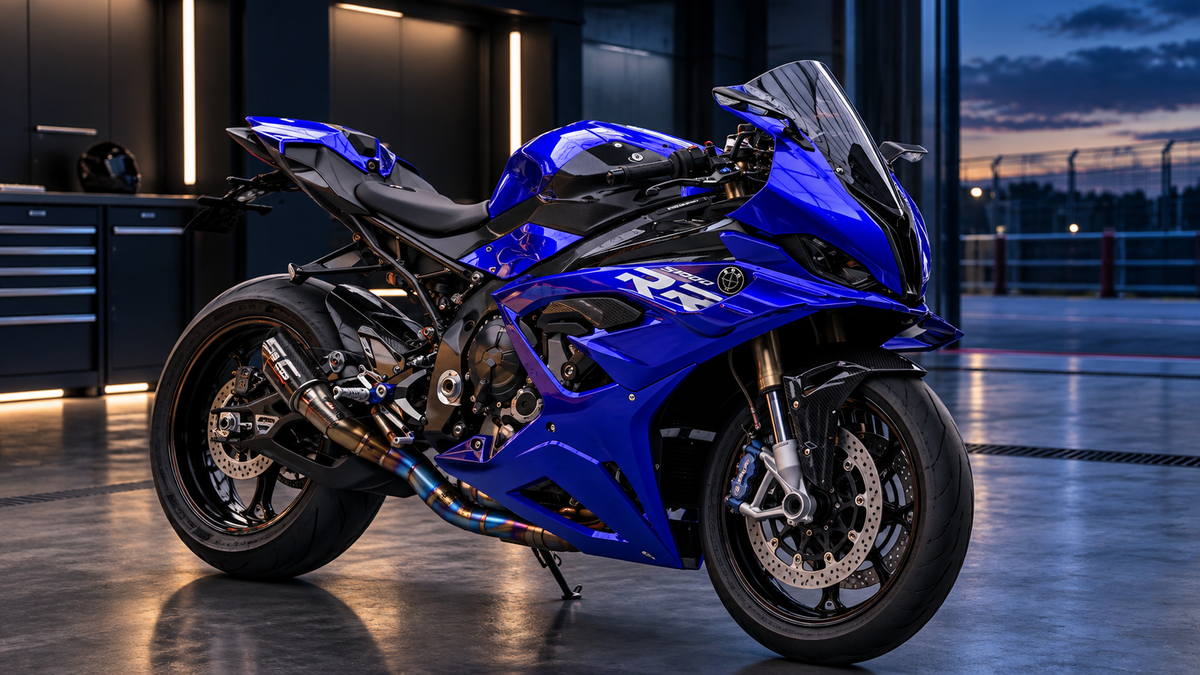
A premium livery is easier to approve when the discussion moves beyond “I like these colors.” The design must still work across panel seams, vents, fasteners and viewing angles. Metallic and pearl colors must be judged in more than one light. Logos need legible clear space, and the production team needs an unambiguous record of finish, placement and orientation.
Use the seven checks below before approving custom paint or printed graphics. They turn a subjective mockup into a production brief that a designer, painter and customer can review together.
Key Takeaways
- Give every color a role: base, secondary area or small accent.
- Review the motorcycle from both sides, the front three-quarter view and the rider's view.
- Check every graphic where it crosses a seam, vent, hole or removable cover.
- Specify gloss, satin, matte and texture by panel.
- Approve real samples or controlled photographs when color accuracy matters.
The Seven-Check Approval Sheet
- Color hierarchy: identify the dominant color, supporting field and accents.
- Body-line flow: trace tank, nose, side-panel and tail lines at normal viewing height.
- Seam continuity: mark where graphics cross gaps or removable parts.
- Logo control: confirm spelling, orientation, permissions and clear space.
- Finish map: assign gloss, satin, matte or textured treatment to each panel.
- Lighting review: compare daylight, shade and workshop-light photographs.
- Production record: freeze the approved views, color references and revision number.
You roll into bike night on a factory red CBR, and nobody looks twice. Stock red, black, and blue blend into a sea of identical machines. The Parking Lot Paradox is real: the most common sportbike colors make you invisible.
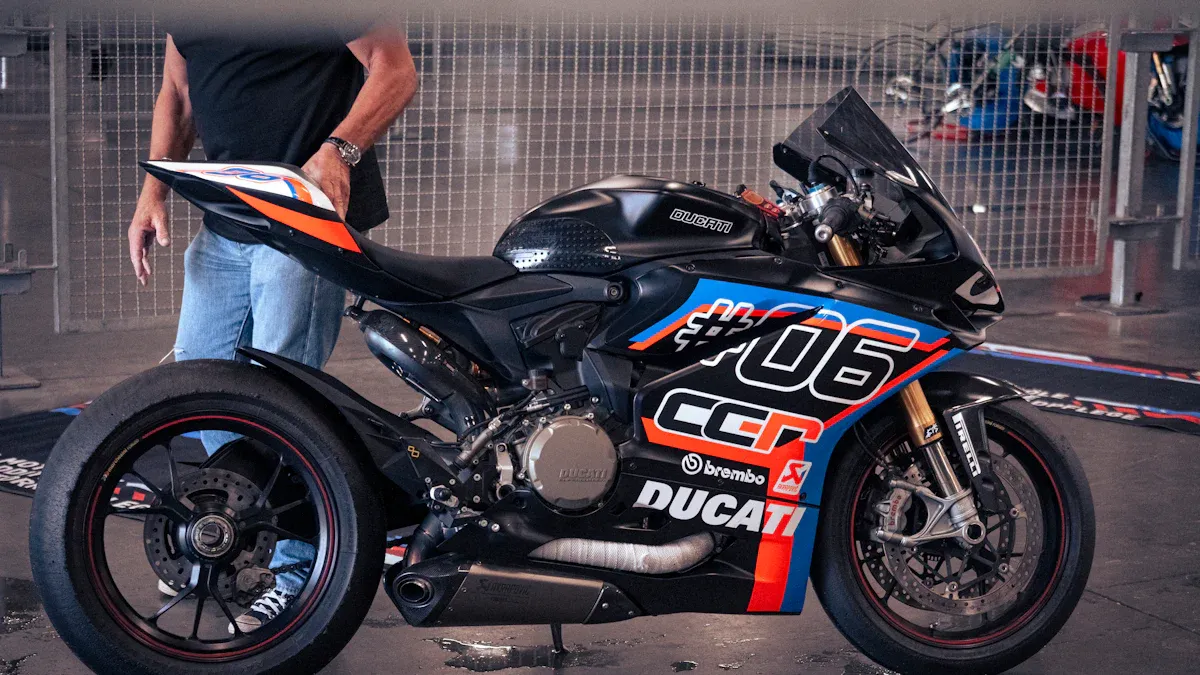
The first unwritten rule is simplicity. Less is more. Start with one clean base color. Limit your palette to two or three complementary hues. A matte black base with a single gold stripe looks premium. A rainbow of decals screams budget.
By the end, you will know the 5 unwritten rules of livery design. You will learn color theory, flow lines, material quality, and how to spot the telltale signs of a cheap build. Think of these as your design brief for building a bike that commands attention.
The 3 Golden Rules of Livery Design
You now know why stock bikes disappear. Building a livery that looks premium without screaming budget comes down to three rules. These rules separate amateur builds from professional designs. Follow them, and your bike looks intentional. Skip them, and you waste time and money.
Rule 1: The "Rule of Three" Colors
This rule comes from real design experience. A fourth or fifth accent color gives the eye nowhere to land. The bike becomes a mess of competing ideas. A red tank with a blue tail, yellow wings, and green accents looks like a parts bin special. It screams budget build.
Here is the formula. Pick one base color for most of the bodywork. Pick one accent color for the main graphics. Use a third color sparingly for details like wheel stripes or a small logo. A matte charcoal base with a single electric blue stripe and silver pinstripes looks premium. The same base with five accent colors looks like a circus bike.
Complementary hues matter. Blue and orange create strong contrast. Red and silver give a clean factory look. Yellow and purple make a bold statement. Random colors pulled from a catalog without a plan always fail. Think about the color wheel every time. Pick opposites for high impact. Pick neighbors for a subtle look. Never pick five colors just because you like each one individually.
Restraint is the hardest part. The paint shop will let you add anything. You must say no to the extra color. You must skip the additional stripe. Less color means more attention on each element you keep.
Rule 2: Flow Lines and Body Geometry
Your sportbike has natural curves in every panel. The tank sweeps toward the seat. The tail rises in a clean arc. The front fairing cuts through the air. Your livery must follow these shapes.
Trace the main lines from the side view. Look at the tank line. Look at the tail line. Look at the fairing edge. A gold pinstripe that mirrors the tank contour looks factory correct. The same stripe placed horizontally across the tank looks wrong. Fight the geometry, and your build looks cheap. Work with it, and your build looks intentional from every angle.
Quality matters in how you apply graphics. The best decals sit under the clear coat. Surface stickers peel at the edges. They fade in direct sun. They catch dirt along the edges. You spot a cheap build from across a parking lot by bubbling sticker corners. Premium builds use graphics sealed beneath UV clear coat. Gold leaf flames show this difference best. Under clear coat, they shimmer with real depth. On the surface, they look like a toy.
The cafe racer world teaches one rule that applies everywhere: function over flash. Every line on your livery should serve a purpose. A stripe follows the tank contour to emphasize the shape. A color block on the tail highlights the natural rise of the bodywork. If a graphic does not follow the body or serve the shape, remove it.
Follow the lines. Let the bodywork decide where graphics belong. Your bike already has a design language written in its curves.
Custom Instructions for Design Archetypes
Think of these archetypes as design brief for your build. Each one gives your bike a clear identity. Pick the one that matches how you ride and who you are.
The Modern Factory Stealth
You want a bike that looks expensive without shouting. Start with Nardo Grey or Chalk Grey as your base. These flat, cool tones read as premium on any bodywork. Choose a satin finish for the main panels. Satin catches light softly and hides minor imperfections better than gloss. Add gloss carbon accents on the front fender, tank edges, or tail section. The contrast between satin paint and glossy carbon creates depth. Keep your accent color to one: black, silver, or a muted bronze. This look works for riders who prefer understatement over spectacle.
The Golden Era Nostalgia
You grew up watching 90s race bikes and want that energy back. Reach for neon purples, teals, and retro pastel stripes. Iconic speedblocks—those stacked rectangular graphics—belong on the tank and side fairings. This style rewards boldness, but it still follows the Rule of Three. Pick one neon hero color, one pastel support color, and white or black as your neutral. The result feels like a factory race replica from a golden decade, not a random sticker collection.
For the Aggressive Track Hero, think subtle sponsor placements and asymmetrical split liveries. One side carries your primary color, the other side flips the scheme. This design looks fast even when parked.
Japanese car culture offers a masterclass in cultural authenticity. Builders in that scene treat livery as a craft. They study period-correct graphics and respect original design language. Apply that same discipline to your design brief. Your bike will look intentional, not assembled from a clearance bin.
Use these design brief as starting points. Adjust colors and placements to fit your riding style. The goal is a cohesive identity, not a copy of someone else's build.
The Reality Check and Visual Audit
Why Phone Screens Lie
Your phone screen glows with back-lit RGB pixels. Sunlight works differently. It hits your fairings, passes through the clear coat, bounces off the base color, and reflects back through pearlescent or metallic flakes. That refraction shifts the shade you see. A grey that looks flat on your screen can flash warm bronze in the afternoon sun. This is normal optical science, not a defect in your kit.
Automotive refinishing experts know this gap well. Under direct sunlight or a raking shop light, a metallic panel with moderate swirl damage looks like someone dragged a wire brush across it. Paint that looks acceptable under one light source often reveals significant marring under another. Owners who have only ever seen their car under indirect artificial lighting are often surprised by what a corrected metallic finish looks like outdoors. Your fairings deserve the same honest test. Step outside before you judge them.
Custom Prompts for the 5-Minute Visual Audit
Before you order, run five quick design brief through your head. First, count your colors. Two or three means you pass. Five means you start over. Second, trace your flow lines. Do your stripes follow the tank and tail curves, or cut across them? Third, check decal placement. Sealed graphics under clear coat beat surface stickers every time.
Fourth, judge finish quality. Satin and gloss should contrast on purpose, not by accident. Fifth, ask about restraint. Does every graphic earn its spot? If you hesitate on any answer, revise the design. These design brief cost you five minutes and save you a full repaint.
Five unwritten rules separate a premium build from a parking lot eyesore. Simplicity wins. Restrain your colors to two or three. Make every graphic flow with the tank and tail. Demand sealed decals under real clear coat. Know when to stop adding.
Plan your livery with mockups before you spend a dime. Mockups are the cheapest tool you own. They expose bad color combos and broken flow lines before paint touches plastic.
Now go build something intentional. Share your finished bike, tag the community, and show off a livery that looks premium, not cheap.
What the Final Approval File Should Contain
The final file should identify the motorcycle view, panel boundaries, approved colors, finish by panel, logo artwork and revision date. Include at least one view that shows the whole motorcycle without dramatic filters. Add detail views only after the overall composition has been approved.
For metallic, pearl or color-shifting finishes, request a sample or a controlled set of photographs that includes daylight, shade and a neutral indoor light. A phone display, social-media filter and compressed screenshot can all change the apparent color. Record which image is the approval reference.
Reasons to Send a Design Back for Revision
- A major stripe changes direction abruptly at a seam.
- A logo is partly hidden by a vent, fastener or rider contact point.
- The left and right views show inconsistent color blocks.
- Matte and gloss finishes are named but not mapped to specific panels.
- The mockup hides the nose, tail or rider's view needed for approval.
- The color reference is a filtered photograph with no physical or standardized reference.
- Two revisions are circulating without a clear final version number.
FAQ
How many colors should my livery use?
Stick to two or three. One base color covers most of the bodywork. One accent color handles the main graphics. A third color works for small details like pinstripes or wheel tape. Add a fourth or fifth color, and your bike looks like a parts bin special.
Why do surface stickers look cheap?
Surface stickers peel at the corners, fade in direct sun, and trap dirt along the edges. You spot a budget build from across the parking lot by bubbling sticker corners. Graphics sealed under UV clear coat stay flat and colorfast for years. Demand sealed decals, not surface vinyl.
Is a custom paint job worth the money?
Why does my fairing color look different in person?
Your phone screen glows with back-lit RGB pixels. Sunlight passes through clear coat, bounces off the base color, and reflects through metallic flakes. That refraction shifts the shade you see. A grey that looks flat on screen can flash warm bronze outdoors. Step outside before you judge the color.
Do my graphics need to follow the bodywork?
Yes. Trace the tank line, the tail arc, and the fairing edge. A stripe that mirrors those curves looks factory correct. A stripe that cuts across them looks wrong. Let the bodywork decide where graphics belong. Fight the geometry, and your build looks cheap from every angle.


