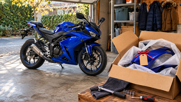

Cover: user-supplied design illustration showing two differently patterned fairing panels. It is not an official Honda V3R photograph, a NiceFairings product photograph or proof of fitment.
One side carries a bold stripe. The other lets the base color breathe. Is that individual, or does it look like a motorcycle assembled from unrelated parts? The difference often lies in the design brief: deliberate asymmetry has a clear relationship between the two sides, even when their graphics are not mirror images.
Honda's V3R 900 E-Compressor is a useful prompt for the discussion. In its EICMA 2026 exhibit announcement, Honda describes the displayed V3R 900 as a planned production model with a distinctive asymmetrical design. The announcement does not provide a release date, confirm parts availability, or claim that the vehicle's structural layout is a template for custom graphics. Those are separate questions.
This article is about the visual choices a rider can make on the fairings of a motorcycle they already own. It does not claim that a large rider community is debating the V3R, or that a NiceFairings kit exists for it.
Structural asymmetry and graphic asymmetry are different
A motorcycle can have physical differences between its left and right sides: openings, exhaust routing, panel shapes, brackets or other components. The V3R announcement calls its design asymmetrical; it does not establish that changing graphics on another bike reproduces the engineering behind that design.
Graphic asymmetry is a choice about paint, decals or other visual elements. A rider might place a diagonal stripe on one side and a smaller color block on the other while leaving both panels and their mounting points unchanged. This is the subject of our guide.
Do not use a design image as a reason to cut a vent, move a component, alter a lamp opening or assume two model years share panels. For existing physical left-right differences, the BMW S1000RR panel-identification article deals with identifying actual pieces. This article deals with how an intentionally different graphic can still look coherent.
Begin with a common visual foundation
Different sides need something in common. That does not mean every detail must repeat. Choose a relationship before drawing the first line:
- A shared base: both sides use the same main color, with different accents.
- A shared accent: each side places the same contrasting hue in a different area.
- A shared geometry: one side uses a long diagonal and the other uses a shorter version with the same direction.
- A shared negative space: both sides preserve a clean zone around the tank, vent or tail.
These are design choices rather than fixed rules. The useful test is to place left and right views next to each other. If the motorcycle still looks like one project when both views are seen together, the relationship is doing its job. If the only common element is a small logo, the design may feel less connected than intended.
Start with the pieces that are not changing: the tank or tank-area trim, wheels, frame, seat and any retained tail section. An asymmetrical scheme that ignores those fixed colors can look compelling as two isolated drawings but disjointed on the actual bike.
Three levels of asymmetry
1. Same palette, different emphasis
Keep the base color and accent hue identical, but give one side a larger graphic. For example, a charcoal body might carry a blue band through the left side and a shorter blue accent near the right tail. The side views are visibly different, while the palette and direction provide continuity.
This is a practical first experiment because it limits the number of simultaneous decisions. Ask for the same blue reference and finish on both sides if that is the intention. If the right accent should be darker or less glossy, state that explicitly. Similar-looking colors on two screens are not a reliable specification.
2. Related shapes, different positions
A diagonal band can start near the nose on one side and near the tank on the other. Repeat the angle or the shape of the endpoint, while adapting each layout to its panel boundaries. The goal is for the sides to feel related, not to make a flat drawing appear perfectly mirrored.
Use the rider's seated position to label vehicle left and right. A front-facing photo reverses the viewer's apparent sides. Label every reference as “rider left,” “rider right,” “front,” or “rear” and avoid relying on arrows alone. That simple convention prevents a compelling concept from becoming an avoidable ordering dispute.
3. Different artwork, one color story
One side might use a large geometric shape while the other carries a quieter field of color. If the bike has a retained bright tank, use that color as a bridge rather than adding several unrelated accents. A strong graphic does not need a matching shape on the other side, but its color, scale or rhythm should relate to something else on the motorcycle.
This is the hardest approach to judge from loose panels. Approve a complete side view for each side, then check the nose and tail where the viewer can see the design transition. A pair of attractive illustrations is not enough if the front view becomes accidentally unbalanced.

The nose is where both sides meet
A rider usually sees one side at a time. The front of the motorcycle is different: both halves are visible at once. Mark the centerline of the nose and the intended boundary around the headlights, windscreen and existing openings. Do you want a centered base color with different side accents, or a deliberate split across the center?
Draw the front view rather than relying on the left and right views to answer that question. A stripe that ends close to the nose on both sides may look like a mistake if neither endpoint is documented. Conversely, a clear change at the center can be an intentional feature when the design explains it.
Keep lights, reflectors, controls and required identifiers unobstructed. Rules differ by location and intended use, and this design article cannot determine road legality. Do not move or conceal safety-related components to make a graphic work. Discuss any uncertainty with a qualified professional and the relevant local authority.
Make the tail a decision, not an afterthought
The tail is visible from behind and often contains several separate pieces. Decide whether the rear view should look centered, continue an off-center line, or bring both sides back to a common base color. Show the area around the seat and any retained parts, including whether a passenger-seat cover is included, separate or not part of the plan.
A stripe can end before the tail and still be complete. The problem is an unexplained endpoint that appears to be missing a piece. Ask the supplier to mark which side carries the final accent and where it stops. Do not assume the cover pictured in a concept sketch is supplied with your selected fairing kit.
What seams and curves do to a flat drawing
A stripe printed on a flat image can appear to bend or change width on a real panel. Different panel gaps, vents, curved surfaces and viewpoint can change the result. Make one view for the overall design and another that marks the critical joins. The graphics across seams guide addresses placement in detail; for an asymmetric design, the additional requirement is an independent decision for each side.
Some breaks are deliberate. A line may stop at a removable panel so that repairs or replacements remain practical. Others are accidental, such as an endpoint on the wrong side of a vent. Write down which is which. A supplier can only respond accurately when the reference shows the intended outcome.
Ask how the artwork will be produced and approved for your actual order. Paint, surface decals and other graphic methods can have different appearance and maintenance considerations. Do not assume a technique or durability level from a photo.
A comparison exercise before you order
Create three versions of the same bike using the same base color:
- Symmetric control: matching graphics on both sides.
- Subtle asymmetry: same palette and angle, but a smaller accent on one side.
- Bold asymmetry: different graphic positions linked by one repeated shape or hue.
Look at the left and right views side by side, then assess front and rear views separately. Ask what you notice first at a small size. If the design relies on small details that disappear, decide whether the larger color blocks still feel balanced. If one side appears much heavier, that may be the desired effect; write it down so the supplier knows it is intentional.
A design visualization is a conversation aid, not proof of a real installation, fit, final paint color or kit contents. If you are comparing renders, keep the same base motorcycle, lighting and view where possible so the design change is the main variable. Do not treat a generated image as a dimensional reference.
Build a brief a supplier can actually use
Send the exact motorcycle model, year, market and known modifications, together with the specific product link you are considering. Supply clear photographs of the front, both sides and tail. Identify any retained tank, seat and wheel colors, plus missing or damaged parts. Ask which pieces are supplied, which components must be transferred and which options require separate confirmation.
Then provide an annotated design sheet:
- Vehicle left and right, labeled from the rider's seat.
- Main and accent colors, reference sources and intended finish.
- Graphic start and end points on each side.
- A front-center view and a rear/tail view.
- Any deliberate mismatches, omitted logos or undecided details.
Explain the purpose in plain language: “Same dark base on both sides; longer blue stripe on rider left; shorter blue accent on rider right; front center remains dark; tail returns to the base color.” This is an illustrative brief, not a claim that the exact finish is available or that an approval service is free.
Use the NiceFairings collections to locate the correct bike and the custom fairings page to discuss what can be made. Confirm the final drawing, scope, color references and any unresolved questions before approving a custom order.
Keep the motorcycle's identity coherent
Honda's V3R 900 shows that asymmetry can be part of a deliberate motorcycle design. Your project does not need to imitate its engineering or repeat its appearance. A shared base, a repeated visual idea and careful front-and-rear views can give two different sides a common identity.
Which would you choose: mirror-image graphics, a quiet difference, or two clearly distinct sides tied together by one palette? The most useful answer is the one you can communicate clearly enough for someone else to produce.
Frequently asked questions
Does asymmetrical paint change how a motorcycle handles?
Changing a visual graphic does not establish an aerodynamic or handling improvement. Structural modifications and fitment are separate matters and should not be inferred from a paint concept.
Does Honda's planned V3R 900 have an available fairing kit?
The cited Honda exhibit announcement describes a planned production model and an asymmetrical design. It does not establish a release date or NiceFairings parts availability.
Can the left and right designs use different graphics?
That is a design option to discuss for the exact kit. Confirm supplier capabilities, graphic method, both side views and the final scope before ordering.
How can I avoid confusing the left and right panels?
Label sides from the rider's seated position, provide separate annotated views and check the front and rear transitions. Identify physical parts and fitment separately from artwork.