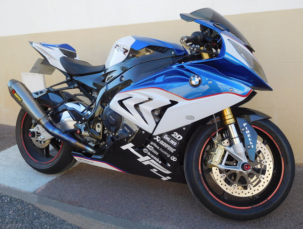
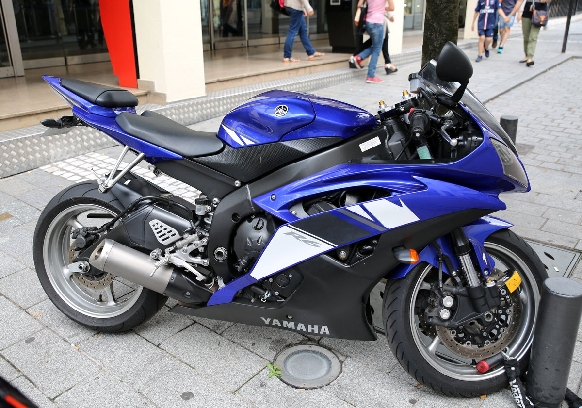
Cover: a blue Yamaha R6 photographed on a city street, used to illustrate color balance on an existing motorcycle—not a 2027 model or a NiceFairings installation example. A1AA1A, Wikimedia Commons · CC BY-SA 4.0. Photograph unchanged.
A dark fairing can turn a bright stripe into the first thing you notice. A white field can make a familiar red block feel new. Looking toward 2027, that relationship between color and space is as interesting as the names on a paint chart. This essay reads selected BMW, Honda, Kawasaki, Yamaha, Suzuki and Ducati examples through proportion, contrast and finish. Official information was checked on September 17, 2026; the visual interpretation is ours. Confirmed 2027 listings sit alongside clearly labeled 2026 heritage context. These examples suggest ideas for a personal fairing design, rather than establish an industry-wide trend.
Key Takeaways
Use a dark base to unify the bike shape. Add a small bright accent to guide the eye.
Use white or light surfaces to create visual space. Each design element then stands out.
Place saturated colors against dark panels. This creates strong focal points without clutter.
Keep heritage color blocks small and restrained. Modern proportions make them feel current.
Let one dominant hue lead the design. Support it with a dark foundation and tiny accent.
Dark Foundations, Small Accents: BMW and 2027 Motorcycle Colors
Blackstorm Metallic and the M Sport Update
BMW Motorrad shared its 2027 model update on July 2, 2026. The official press release shows one color and equipment change that matters here. The S 1000 RR Edition M Sport gets Blackstorm Metallic with M Motorsport decals. The Bluestone metallic Sport finish is no longer offered. This is a listed color and equipment update. It does not prove a whole new fairing shape.

The attraction of a dark motorsport-inspired palette is the contrast it makes available. A near-black foundation lets brighter graphics become focal points. For an original design, try changing the area of the accent before changing its hue. A broad stripe and a narrow line can use identical colors yet give the motorcycle very different visual weight. This is a composition exercise, not a description of every detail in the BMW factory scheme.
Why Black Still Carries the Silhouette
A near-black base does something clear to how we see shape. Dark surfaces soak up light and soften the lines between panels. The eye sees the motorcycle as one smooth shape instead of a pile of separate parts. A small motorsport stripe then becomes a focus because it stands out. The stripe does not need to be big. It needs the right spot. A thin line or a small block near the tank or tail can guide the eye along the bike's length. That motion hints at speed even when the bike is parked.
Keeping the tank and wheels black helps this effect. When the tank, wheels, and main body share a dark color family, the whole look feels grounded. Nothing seems out of place. The accent color looks planned, not just added. This is order at work. One main color carries the shape. One extra color marks the identity.
How the paint finish looks adds another point. A metallic near-black catches light on curved surfaces. Highlights move as you change your viewing angle. A matte finish works differently. It gives a flatter, heavier shadow and does not shine. At speed, a metallic surface sparkles with passing lights. A matte surface stays visually calm. Neither option is better. Each one changes how the same shape appears when moving.
A limited palette asks the shape to do more of the work. Dark areas can merge in shade, while highlights pick out their edges in stronger light. Check the silhouette against both a light background and a dark one. A design that looks sharply defined in a studio photograph may read as a much quieter mass outdoors. Neither impression is inherently wrong; choose the one that suits the result you want.
The design observations here are our interpretation of the selected examples, not an account of BMW's stated intentions.
White Space and Saturated Color: Honda and Kawasaki
Honda's Pearl White and Clean Panel Reading
Honda's 2027 CBR1000RR page shows Pearl White as one paint choice. The official Honda USA listing confirms this color for the model year. This is the CBR1000RR, not the CBR1000RR-R Fireblade SP. The page does not say if Pearl White is new for 2027. Readers should see it as a confirmed option, but not assume it replaced another color.

White panels change how a fairing looks. A white surface reflects more light and gives visual space. The eye sees empty space between graphics. That empty space is not a lack of design. It is a choice that makes each shape matter more. A white base shows every seam and curve. Designers who pick white know the form must be clean. There is no dark shadow to hide bad transitions.
This idea ties into the larger 2027 color talk. White acts as a neutral base. One bright accent becomes a big visual moment. The accent does not fight with the base. It sits on calm space and pulls the eye right away.
Kawasaki's Plasma Lime Green and Deliberate Emptiness
Kawasaki Europe's August 24, 2026 announcement lists the 2027 Ninja 1100SX in Metallic Carbon Gray / Metallic Diablo Black. The SE offers Plasma Lime Green / Metallic Diablo Black or Pearl Stardust White / Metallic Diablo Black. These are European specifications; this source does not establish US availability.
Lime green beside a dark neutral offers a strong contrast. In a personal design exercise, place the bright color in one area and let the dark field frame it. Then reverse the balance: make green the broad surface and black the interruption. Comparing those two sketches is more useful than assuming a small accent is always best. Both can feel deliberate when the division follows a clear idea.
Empty space on a fairing is a design choice. A big black panel with one green stripe uses empty space as a frame. The green does not have to cover all the bike. It needs the right size and spot. That restraint makes the color seem planned. The eye sees the green as a sign, not as decoration.
Heritage Blocks and Modern Restraint: Suzuki and Yamaha
Suzuki's 40th Anniversary Color Blocks
Suzuki's US 2027 GSX-R1000R 40th Anniversary Edition listing pairs Pearl Tech White with either Pearl Vigor Blue or Candy Daring Red. For this essay, those two US pairings provide a starting point for thinking about heritage color blocks. They are not a combined worldwide color catalog.

The two-tone layout carries the design weight. A blue or red block sits against a white field, and the white does the framing. The block does not cover the whole fairing. It takes up a set area, often the upper or mid-panel, and the white holds the rest. That mix matters more than the color itself. A big block feels bold. A narrow block feels sharp. The same two colors can look very different based on where the dividing line falls.
Heritage color can feel familiar without fixing the size of every graphic. In a new sketch, keep the blue-and-white relationship but move its boundary, reduce a secondary stripe, or leave a larger quiet field. A broad block can feel purposeful too. The useful question is whether its size supports the whole motorcycle, rather than whether small graphics are automatically more modern. This is a design proposal, not a claim that Suzuki changed its proportions by a measured amount.
Yamaha's 70th Anniversary as 2026 Context
Yamaha's US R9 specification page identifies a 2027 model. Separately, Yamaha Europe's anniversary announcement describes white-and-red 70th anniversary liveries for the 2026 R125, R3, R7 and R9. We use those as 2026 heritage references, not as confirmation of new 2027 colors.
A white-and-red heritage palette offers a useful exercise for a future personal project. Red can create a focal area while white gives the eye a quieter field around it. Try aligning the boundary with the sweep of a panel, then compare a version where the block crosses it. The first may emphasize the body shape; the second may make the graphic feel more independent. These are alternative visual choices, not rules for recreating the anniversary motorcycle.
A historic palette feels current when the designer trusts proportion over decoration. Two colors, one clear split, and enough white to breathe. That formula does not age. It just waits for the right placement.
Translate Inspiration Into Your Own Fairing Brief: Ducati and 2027 Motorcycle Colors
Rosso Centenario and the Discipline of One Dominant Hue
Ducati's World Premiere 2027 page records the March 26, 2026 unveiling of the Superleggera V4 Centenario. The Don't Call Me Rosso story names the GP26 Rosso Centenario livery for that motorcycle. The event label and the 2026 centenary do not prove that every Panigale receives this scheme for 2027. No predicted new Panigale or R-model should be treated as fact here.

For a personal design inspired by a deep red, start by making that hue the first thing the eye reads. Existing dark wheels, a seat or lower components can provide a supporting frame. This is a suggested arrangement for your own motorcycle, not a claim about the factory tank and wheel colors on the Superleggera. Consider which parts will remain unchanged before deciding how far the red should extend.
Negative space makes the red feel larger than it is. A fairing with large red panels and small black gaps creates a rhythm. The gaps are not empty. They are pauses. Those pauses let the red breathe. A rider sees the shape as one flowing form. The color does not compete with the form. It amplifies it.
Finish changes the impression of a red surface. Gloss produces sharper reflections that can emphasize curvature; a matte finish creates a softer highlight. Neither finish guarantees that surface defects will disappear. Compare samples under the same light and viewing angle, then consider the appropriate care instructions for the finish. Photographs and screens help communicate a direction, but they cannot settle an exact physical color match.
Building an Original Palette, Not a Model Replica
To develop a personal version, choose the color you want to notice first. Then identify the parts that will stay their current color: the tank, wheels, seat and exposed components may already supply your neutral base. Add an accent only if it improves the composition. There is no need to repaint every component to make the fairings feel connected to the rest of the bike.
Proportion matters more than the exact color code. A deep red that covers most of the fairing feels bold. The same red on half the fairing feels sporty. The same red on a small stripe feels like a detail. The color has not changed. The area has. Designers who understand this can build a palette that feels intentional.
NiceFairings supplies made-to-order painted ABS exterior fairings. A useful brief names the exact motorcycle and year, identifies the parts included in the order, and describes the dominant color and graphic boundaries. Use the custom fairings page to discuss available designs and confirm the scope before production. A design discussion is not confirmation of 2027 inventory, fitment or an exact OEM paint match.
The real motorcycle photographs are labeled as visual references. The paper composition and burgundy finish study are AI illustrations, not actual 2027 motorcycles or OEM color standards. The ideas here are editorial interpretation only. They are not claims about Ducati's design intent.
For a concrete older-model example, the custom-painted Yamaha YZF-R6 2008–2016 fairing kit listing offers several paint designs and a custom-design option. Its stated year range belongs to that product; it does not establish compatibility with a 2027 R9 or any other motorcycle discussed above. Use the listing to start a design conversation for the named R6, then confirm the exact bike and included pieces.
The most useful takeaway from these selected examples is a way of looking: identify the dominant field, the accent and the space around it. Try the same palette in two or three proportions before choosing a direction. A new look can come from moving a boundary rather than adding another color. For more on the specific BMW announcement, see our 2027 BMW S1000RR color discussion. The broader essay here remains an interpretation, with its September 17, 2026 source cutoff and market distinctions intact.
FAQ
Is the 2027 color mood an official industry trend?
No. The dark bases, limited bright colors, and open space we talk about here come from our own reading of chosen examples. No company has said this is their design plan. Six brands do not make a real trend. Think of this mood as one way to look at things, not a prediction.
Which 2027 color facts are actually confirmed?
The confirmed items are the BMW S 1000 RR Edition M Sport update, the Pearl White CBR1000RR from Honda, the European Kawasaki Ninja 1100SX color set, and the Suzuki GSX-R1000R 40th Anniversary Edition colors. Yamaha's 70th anniversary paint jobs are still 2026 context. Each item links to its official source above.
Why is Yamaha's 70th anniversary not counted as 2027 news?
Yamaha Europe put out that white and red anniversary material as 2026 context. The 2027 YZF-R9 specification page identifies the model year and technical specifications; it does not turn the older anniversary announcement into 2027 color news. Calling the anniversary a 2027 announcement would make up a claim the sources do not back.
Does Ducati's Rosso Centenario apply to all 2027 Panigales?
No. The GP26 Rosso Centenario livery is named for the Superleggera V4 Centenario shown on March 26, 2026. The World Premiere 2027 event label and the 2026 centenary do not prove the scheme spreads to the whole Panigale range. No predicted model should be taken as fact.
How does a rider turn this inspiration into a fairing brief?
Choose the main color, account for components that will keep their existing finish, and describe where the graphic boundaries should fall. Include the exact model and year and confirm which pieces are available. A visual reference communicates a direction; it does not establish fitment or guarantee an OEM paint match.