Nardo-inspired grey, retro heritage liveries, carbon-look accents, personal numbers and two-tone color blocking offer five different starting points for a custom sportbike. These are editorial design ideas for 2026, not a sales ranking. If you want a track-inspired look that still feels right at a weekend meetup, start with the visual character you enjoy rather than a claim about what everybody else is buying.
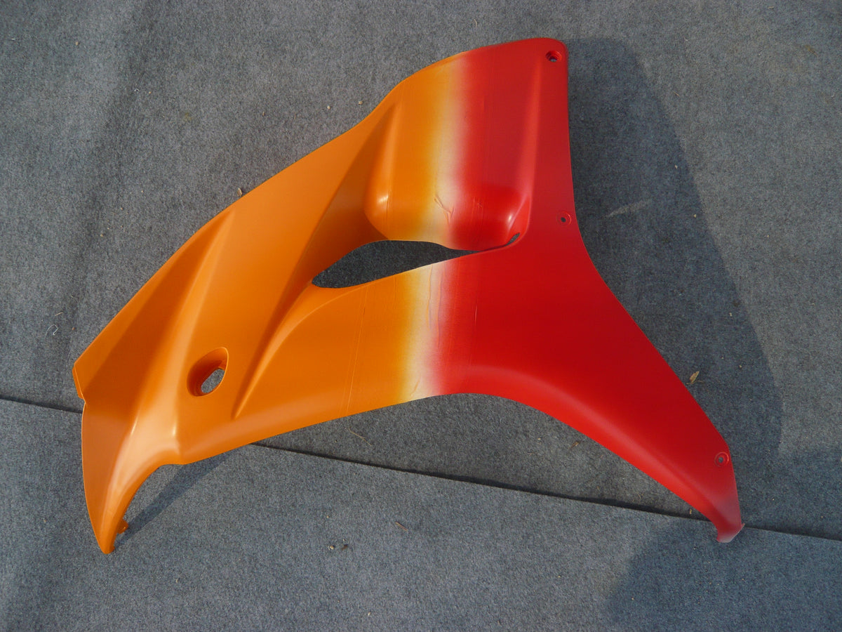
Each direction below comes with a palette, an everyday scenario and a practical tradeoff. The aim is to help you choose a clear direction for your custom motorcycle fairings. The cover is a NiceFairings production photograph of an orange-to-red panel. It shows a blended boundary; the hard-edged color blocks below are another option. Body illustrations are labeled AI concepts, not customer photographs or exact OEM colors.
Choose the Main Visual Feature First
| You want people to notice... | Start with... | Keep secondary details quiet |
|---|---|---|
| The body shape | A mostly solid color | Limit extra stripes and lettering. |
| A familiar racing-era mood | A restrained retro palette | Pick one graphic reference, not several competing eras. |
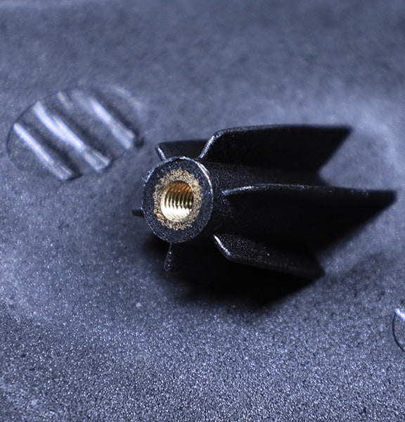
| A close-up surface detail | A small carbon-look accent | Leave enough plain paint around it. |
| Your own number | A clear number field | Test readability before adding graphics. |
| The overall color balance | A two-tone split | Compare boundary placement before choosing more colors. |
Choose one leading idea and one supporting detail. For example, a two-tone layout can carry a small personal number, but neither needs to dominate every panel. This is a selection exercise, not a ranking of popular designs or a prediction of resale value.
1. Clean Solids: Nardo-Inspired Grey, Satin Black and Blue
Clean solid colors give your sportbike a sharp look without busy decals. These finishes remove clutter and let the shape of the bike stand out. You can pick a light grey inspired by Nardo or go dark with satin black.
A quiet grey or a small satin-black contrast
Think of Nardo Grey as a color reference, not an exact match promised by a photograph or a name. If matching matters, discuss an agreed physical reference with the painter. Picture your motorcycle at a local hangout on a Saturday morning. The grey finish picks up light in different ways on the tank and tail. It looks sharp without trying too hard.
Satin black gives you a different kind of restraint, with softer reflections than gloss. You could put a thin red stripe on the front fender or keep the painted bodywork largely black. The practical tradeoff is finish care: agree on the finish and follow the coating supplier's care instructions. A satin appearance does not guarantee that flaws or fingerprints will disappear.
Deep blue and muted tones for street riders
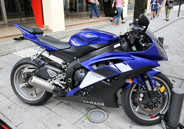
Deep blue is another choice if grey feels too quiet. You can consider a dark metallic blue that looks different as the light changes. That gives you depth without a large graphic. Picture your bike parked at a weekend meetup: a blue main panel and a small silver detail can supply the whole visual idea.
Muted tones like charcoal or slate mix calm with character. Try a broad charcoal field with a small blue accent, then compare it with an all-blue version. The tradeoff is that a very restrained scheme may feel less distinctive from a distance. Judge it in daylight and from several views rather than choosing from a tightly cropped online photograph.
2. Retro Heritage Liveries With Room to Breathe
Retro motorcycle liveries bring a sense of racing history to your street bike. Bold shapes and a limited palette do much of the work. You do not need to reproduce every sticker on an old race motorcycle to create that feeling.
Block stripes, lettering and a limited palette
Block stripes are a useful starting point. Try thick cream or white lines over a dark red base. The stripes can follow the natural body lines from front to back. Asymmetric color blocks offer a bolder twist. You split different colors at the front fairing, then let them flow across the center line. Compare that with a simpler side-panel block before committing.
Large old-style lettering across the side panels can echo old race programs. Keep the colors tight: cream and red, or yellow and deep green, offer two possible directions. One tradeoff is commitment. A loud retro scheme draws attention every time you park; choose a reference you still enjoy when the novelty wears off.

For a deeper choice between a documented factory-style reproduction and a personal interpretation, see our restomod design guide. Here, use the retro direction only if a particular palette or graphic rhythm is what you want the eye to notice first.
3. Carbon-Look Accents in Small Doses
Choose this direction when you want texture to be the close-up detail rather than the main color story. A small patterned field beside plain paint may be enough. Decorative carbon-look treatment is not structural carbon fiber and does not establish a weight saving.
First select the area to emphasize, then confirm the available process and pieces with the supplier. Our carbon-look boundary guide covers pattern direction and paint edges in detail.
4. Personal Numbers and Rider Identity
Choose a personal number when you want one readable graphic to carry the design. Compare two sizes against a quiet background before adding stripes or extra lettering. A small tail number and a large side number communicate differently even with the same digits.
Panel breaks and curves may interrupt the artwork. Our personal-number layout guide covers that next step. This is a styling choice, not advice on competition number regulations or a claim of team affiliation.
5. Two-Tone Color Blocking
Two-tone color blocking splits your fairings into two different colors. You make a bold look by dividing the bike's shape with a clean line. The split can go in different directions. Each choice changes how the bodywork looks from the side.
Diagonal, horizontal and left-to-right splits
A diagonal split runs across the fairing at an angle and can suggest motion. Your eye follows the line from bottom to top. A horizontal split divides the bodywork into upper and lower areas: the top might be navy while the bottom is cream. This works as a useful sketch exercise on sportbikes with long side panels. A left-to-right split gives each side its own color, creating a different impression as you walk around the motorcycle.
Custom paint designs give you the freedom to choose where the line falls. You can move it higher or lower depending on how much of each color you want. Try these pairs as starting points, not a popularity list:
- Deep navy and warm cream for a calm, graphic look.
- Grey and muted red for a restrained base with a warmer accent.
- Metallic blue and silver for a crisp contrast.
- Black and a small green field for a brighter interruption.

Compare the proportions before adding more detail
Imagine the bike outside your home rather than under show lighting. Does the cream section still feel balanced beside the wheels and seat? Try the same colors with the boundary moved up or down. A larger light area may emphasize the panel shape; a smaller one may read as an accent. Neither arrangement needs extra logos to make it complete.
The tradeoff is how the graphic crosses separate panels. A line that looks continuous in a flat sketch may break awkwardly at a vent or joint. Ask to review both sides and the front view. If you are starting with a Kawasaki fairing kit, choose the exact model and year first, then work with those actual panel boundaries.
Turn Your Favorite Idea Into a Clear Fairing Brief
You have chosen a direction. Now you need to turn that idea into a specific request. A clear brief helps reduce misunderstandings about the bike, the included parts and the finished appearance.
Agree on the color target and scope
Give your painter a verified manufacturer paint code when you have one. Include the brand, code and finish. If no verified code exists, discuss a physical reference or a written color target. Label each reference clearly, such as “Blue A” and “White B,” and ask which sample or matching options are available before assuming they are included.
Screen images and hex codes cannot promise an exact physical match. Avoid trusting color names by themselves: “red” or “blue” can mean different things to different people. For a fuller walkthrough, use our custom fairing design-brief guide. Include your exact model and year, requested pieces, finish and approved artwork.
Check finished photos when available
Ask about finished photos before you order. NiceFairings' custom fairings service says these can be provided before dispatch whenever possible. Use them to review layout, spelling, visible workmanship and graphic alignment against the agreed brief. Lighting and camera settings affect paint on screen, so photo approval does not guarantee a physical color match.
Choose one main direction and send a reference with two or three specific things you want to keep or change. That is a more useful starting point than collecting unrelated images indefinitely. When you are ready to identify the correct kit, use Shop by Bike and confirm the model, year and available pieces before finalizing the design.