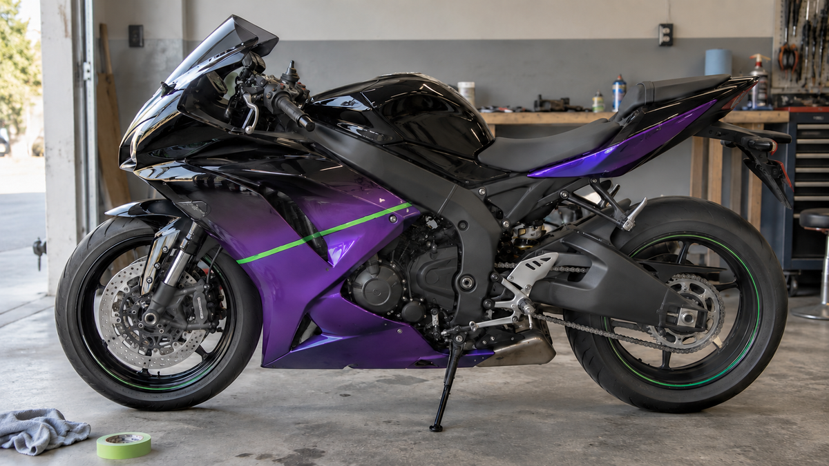
Cover disclosure: AI-generated editorial concept. It is not a NiceFairings product, customer motorcycle, track test, or fitment reference.
An AI-generated black-to-violet Ninja with acid-green highlights may look finished on a phone screen, but a buildable livery needs more than a color description. The rider must identify the exact Kawasaki, decide where the gradient begins and ends, specify how the two sides relate, and separate custom artwork from logos or physical changes invented by the generator.
This guide is for that handoff. It will help you mark the color transition, review it on the correct panels and explain revisions precisely. Begin with the Kawasaki fairings collection, select the actual model family, and submit a documented brief through the custom fairings page. Screen color is direction, not a promise of an exact physical match.
Key takeaways
- Identify the bike before choosing a catalog page or approving artwork.
- Define a gradient with fixed visual checkpoints, not only “black into purple.”
- Use bright green as a hierarchy tool, not as decoration on every edge.
- Review both sides and the assembled viewing angles.
- Keep sponsor marks, race numbers and copyrighted graphics out unless authorized.
- Confirm included panels and retained parts in writing.
What a gradient brief must add
Our Ninja 400/500 livery brief covers the overall color hierarchy for those lightweight models. The under-clear versus surface-sticker guide covers graphic placement in a finish. A gradient needs a separate decision: where each color begins, reaches full strength and ends on the actual fairing. That decision cannot be made from an attractive three-quarter render alone.
Select the actual Ninja family
“Ninja” covers motorcycles with different bodywork. Record the model, model year and market, then photograph the current bike from all four sides. Note modified exhaust parts, frame protection, lighting, windscreens, tails and previously replaced panels.
Use the Ninja 400 collection, ZX-6R collection or ZX-10R collection only after that identification. A similar green accent, headlight shape or online caption does not establish compatibility.
Separate gradient, reflection and shadow
AI renders commonly create a violet “paint” area that is actually a reflected light source. Mark three zones on the reference:
- the darkest base that should remain black under diffuse light;
- the transition region that should visibly carry violet color;
- the final accent region where purple is strongest.
Then write where those zones should appear on the real bike. For example: “Black begins at the nose and upper panel; violet becomes visible through the center of the side cowl; the lower rear portion is the strongest purple; the belly remains predominantly black.” This can be reviewed. “Copy the glow” cannot.
Choose whether the transition should be smooth, pearlescent, misted, faceted or separated by a graphic. Do not assume every paint or printing effect in a generated image is available. Ask the supplier to confirm its approach for the quoted project and approve a model-specific proof.
Make acid green a navigation system
The brightest color should guide the eye. Pick a primary green path—perhaps nose to side—or one repeated marker at three points. Keep its width and role consistent. If it outlines every opening and edge, the scheme may become visually noisy and small placement differences will dominate the finished bike.
Check the design as a tiny thumbnail. The silhouette and one green path should remain legible. Then zoom in and inspect the start and stop points around seams, holes and recesses. A successful design works at both scales.
Decide what “retro” means
If the concept also references 1990s racing, list the actual traits you want: large color blocks, offset stripes, a period-style number panel, or a limited type treatment. Do not request a vague “KRT retro replica” and assume every mark can be copied. Historical inspiration can be expressed with proportion and rhythm without reproducing sponsor logos.
If using a personal race number, check the street-bike race-number readability guide. Confirm local legal and visibility considerations separately; a design proof is not road-use approval.
Review the gradient on every supplied piece
Ask for left and right views plus front and rear references. The two sides may be mirrored, related but asymmetric, or intentionally different. State which. A gradient that reaches peak violet on the left lower panel but stays black on the right may be a mistake or an intentional feature; the proof should remove ambiguity.
Use a checkpoint table:
| View or area | Base | Transition | Bright accent | Approval question |
|---|---|---|---|---|
| Front/nose | Predominantly black | Minimal violet | One green path | Does it remain clear around lights and intake shapes? |
| Left side | Black at front/top | Violet through center | Defined green markers | Do lines cross seams deliberately? |
| Right side | State mirrored or unique plan | Record the same checkpoints | Confirm direction | Is asymmetry intentional? |
| Belly/lower | State black or purple priority | Avoid accidental muddy band | Restrained accent | How does it read from standing height? |
| Tail | Repeat one visual cue | Do not restart the whole gradient | Small green endpoint | Does it relate to the front without clutter? |
Put graphics in the order, not in assumptions
Ask whether the requested design uses paint, printed graphics, decals, or a combination, and how the supplier describes its finish. Do not state that every graphic is permanently buried under a particular number of clear layers unless the order record confirms it. Likewise, do not promise resistance to fuel, track rubber, chemicals or UV without documented testing and defined conditions.
The practical approval questions are visible placement, smoothness within the available process, color relationship, care instructions and repairability. A glossy photograph can support a finish review but cannot prove long-term durability.
Compare costs by scope
Online price comparisons often leave out supplied pieces, preparation, transfer parts and shipping. Compare written quotes with the same scope instead:
| Cost row | Used or new OEM route | Custom painted replacement set |
|---|---|---|
| Supplied pieces | List each identified part | List each quoted panel |
| Finish work | Existing finish, refinishing or mixed colors | Approved custom finish in the written scope |
| Graphics | Existing, removed, replaced or added | State artwork and approval revisions |
| Transfer items | Identify emblems, mesh, ducts and hardware | Identify what is reused or bought separately |
| Preparation/installation | Quote inspection and labor | Quote pre-fit and installation labor |
| Shipping/tax | Record actual seller terms | Record current supplier terms |
| Unknowns | Mark unknown, not zero | Mark unknown, not included |
This produces a fair comparison without inventing a universal saving.
Send a useful custom request
Provide the exact bike details, four-side photographs, the original AI reference, an annotated gradient map, color priorities, desired sheen, authorized graphic files and a list of modifications. State what must remain unchanged. Ask for the supported product scope, current proof process, current timing information and the written list of supplied pieces.
After proof approval, retain the approved version. When finished photos are provided, compare observable features without treating photos as dimensional inspection. On delivery, use the unboxing inspection checklist before installation.
Create a gradient control strip
A written gradient is easier to approve when it has visual checkpoints. Ask the designer to show a simple strip or swatch sequence that represents the darkest black, early violet, peak violet and the green accent. Label these A through D in the project notes even if the labels do not appear on the motorcycle.
On each proof view, mark approximately where A, B and C occur. This does not prescribe a paint formula; it provides a shared vocabulary. If the revised proof turns the nose purple when the brief called for black, the rider can say “keep the nose in A” instead of sending another ambiguous screenshot.
Check the strip on more than one display and under normal brightness. The purpose is relative order, not an exact screen match. The physical result still depends on the confirmed materials, process and lighting.
Use two review distances
At distance, the bike should have a recognizable color flow. The green path should not fragment into unrelated marks. The purple should read as an intentional region rather than a reflection or dirty black. Take a proof screenshot at the approximate size of a blog card or social thumbnail and check it there.
At close range, inspect line endings, transitions and small gaps. Look for a green sliver that lands too close to a fastener, a gradient boundary that changes abruptly at a seam, or a black graphic that vanishes into an opening. These are design-review findings, not evidence of production quality; they need to be resolved before approval.
Plan for a future repair without predicting one
Ask how the design files and approved color direction will be retained. A complex gradient may be harder to reproduce on a single replacement panel than a solid color, especially after the surrounding finish has aged. That does not mean a future repair is impossible, and this article should not claim a particular outcome. It means the owner should keep the approved proof, order record and finished photographs.
Consider whether the brightest transition crosses several high-exposure panels. If repairability is a priority, a deliberate seam break may be preferable to a continuous gradient that depends on several pieces reading as one field. This is an aesthetic tradeoff to discuss during design, not a reason to avoid gradients entirely.
Example revision record
Suppose version A uses too much green and the right side peaks in violet farther forward than the left. The revision request should read: “Reduce green to the nose line, one side-cowl marker and tail endpoint. Move the right-side peak-violet checkpoint rearward to align visually with the left when viewed from each side. Keep the black belly and all existing seam margins unchanged.”
When version B arrives, check only those requested changes first, then repeat the full approval checklist. This prevents a corrected gradient from silently introducing a new logo, moving a number field or changing the base sheen.
Photograph the current bike for color context
Even a complete visual reset sits beside retained components. Photograph the tank, wheels, frame, seat, windscreen and visible hardware under diffuse daylight. Record whether each item should blend with the new fairings, remain a neutral boundary, or act as deliberate contrast.
This step matters with green because a small retained factory-green item may be close to the new acid accent without actually matching it. Decide whether near-match is acceptable. If not, separate the colors spatially or choose a deliberately different green. Do not let an ordinary phone photograph become a promise of exact color matching.
Add the context images to the proof folder rather than pasting them over the artwork. Label them “retained-part reference” so no one mistakes them for supplied pieces. If the rider later changes wheels, tank cover or windscreen, return to the color map before final approval.
Keep the color idea separate from fitment
The gradient method can apply to several Kawasaki families, but the resulting order remains model-specific. A ZX-6R photograph does not prove a Ninja 400 finish option, and a ZX-10R product listing does not define another model's contents. The unbranded cover at the top of this page is an AI editorial concept, not a photograph of a NiceFairings kit or evidence of Kawasaki fitment.
Identify the motorcycle and submit the brief through the custom fairings page. Ask which kit, panels and finish options can actually be quoted for that specific project; do not assume one black-violet-green kit is ready for every Ninja.
FAQ
Can you match the exact AI purple?
Treat screen color as direction, not a guaranteed physical match. Supply clear priorities and ask what reference and approval methods are available.
Can one design work on a Ninja 400, ZX-6R and ZX-10R?
The color concept can be adapted, but panel geometry and kit scope must be handled separately for each supported model and year.
Are the graphics guaranteed not to peel or fade?
Do not make an absolute claim. Confirm the actual process and care guidance for the order, and keep long-term statements tied to evidence.
How long will production take?
Ask for a current estimate for the specific order. Do not rely on a fixed duration copied from an old article or social post.
Can I use racing sponsor logos?
Only provide artwork you are authorized to use. Ask the supplier to flag any element it cannot reproduce.
The decision before approval
Do not approve only the color mood. Approve a named version of the four-view proof, the A-to-D color checkpoints, the green accent path, each intentional seam break, the included panel list and the retained-part references. If any of those remains uncertain, ask for a revised proof or a written scope clarification before ordering.